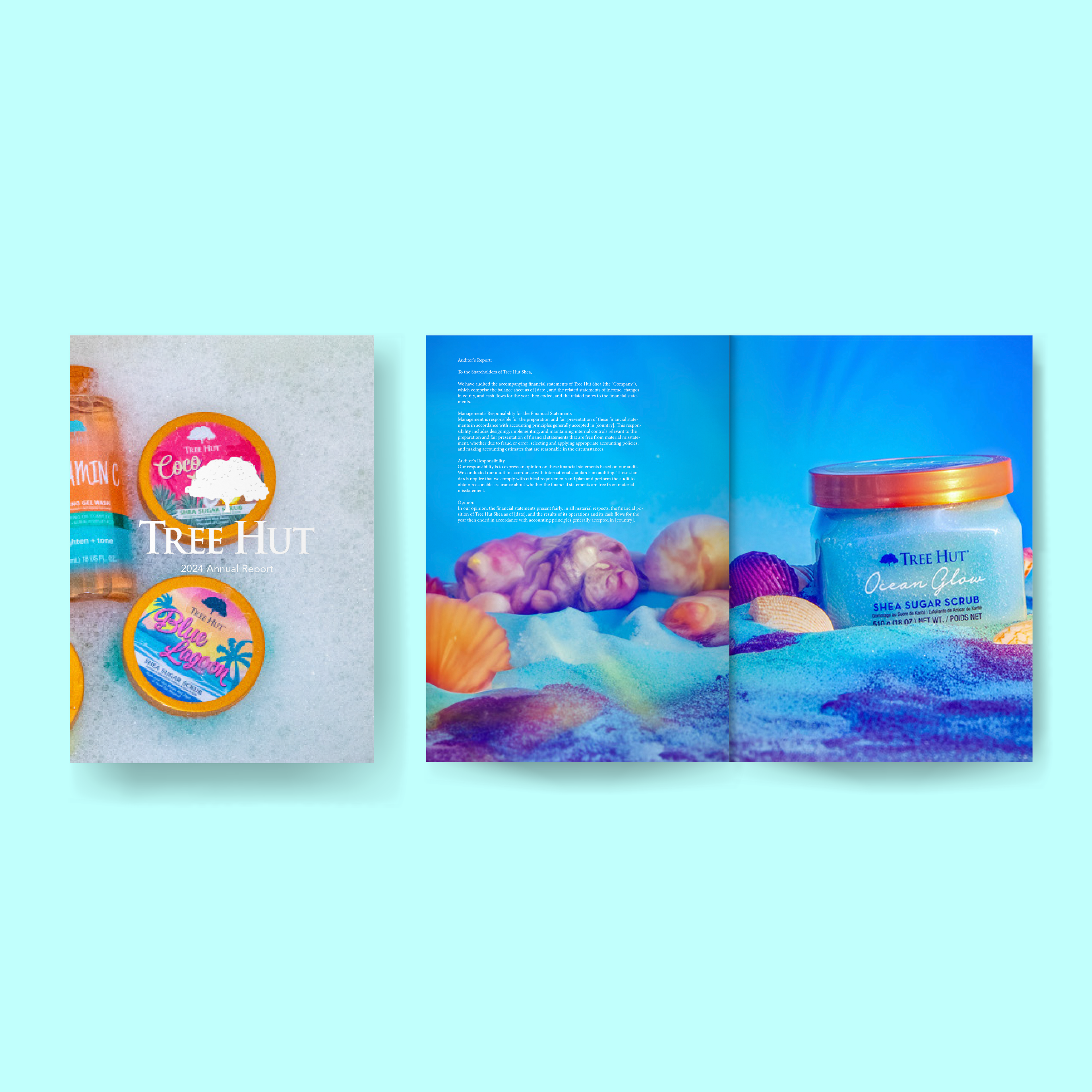
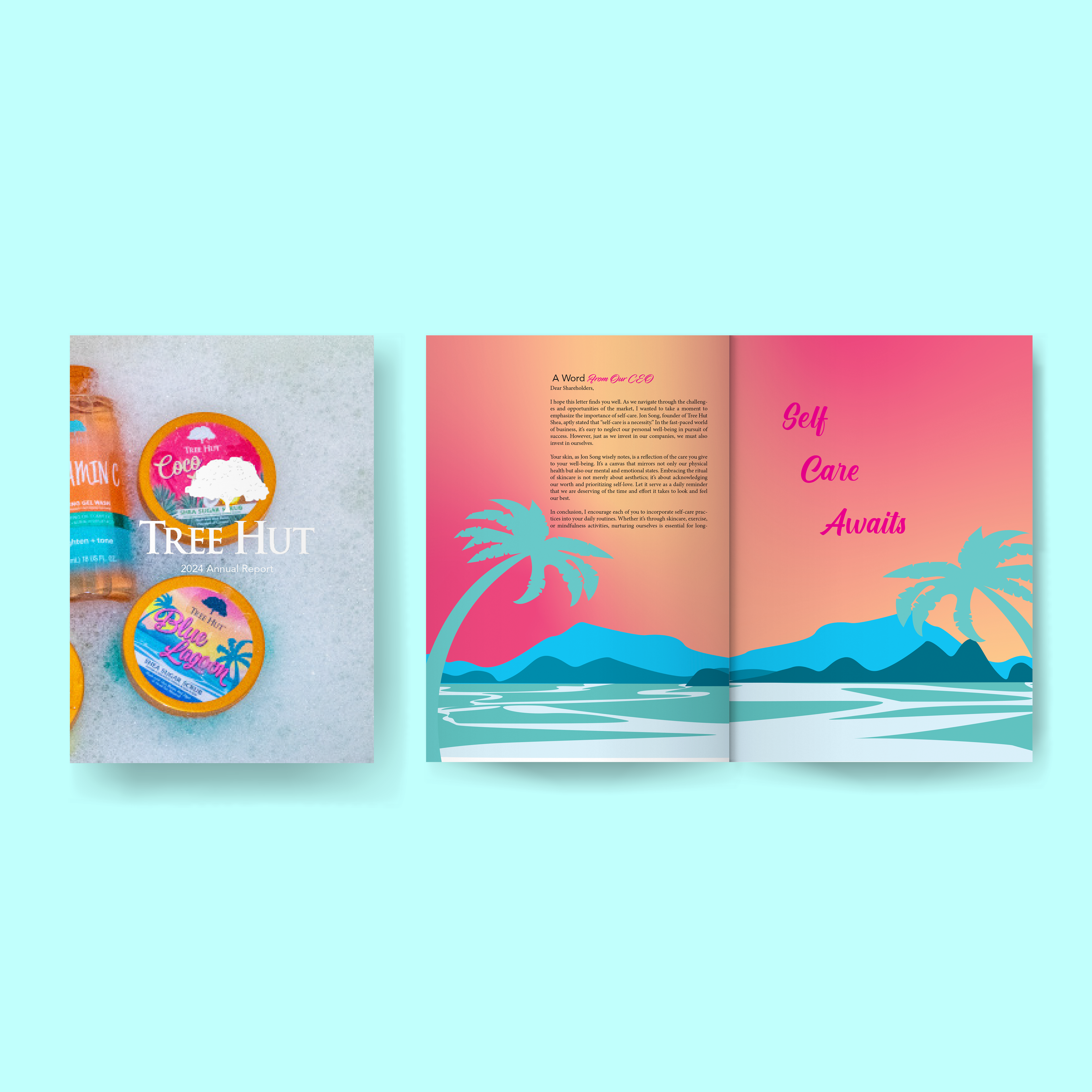
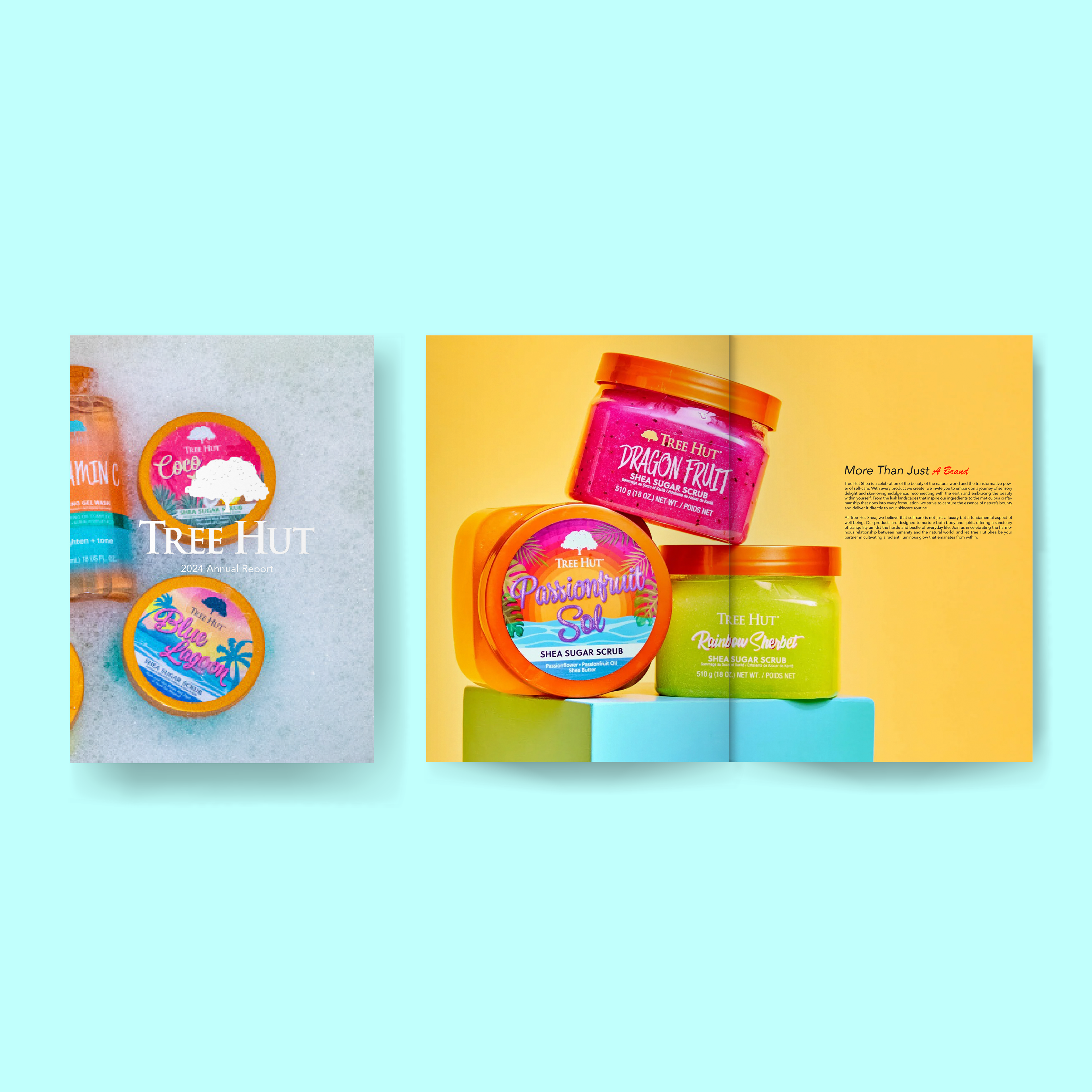
Tree Hut Annual Report
I was assigned the task of designing the annual report for the brand Tree Hut. In crafting the report, I made a deliberate choice to incorporate a blend of brand photographs and original illustrations to align with Tree Hut’s aesthetic. This approach not only emphasized the brand’s visual identity but also allowed me to infuse unique elements that complemented Tree Hut’s essence. The resulting annual report effectively captured the essence of the brand while showcasing its achievements and progress over the year.
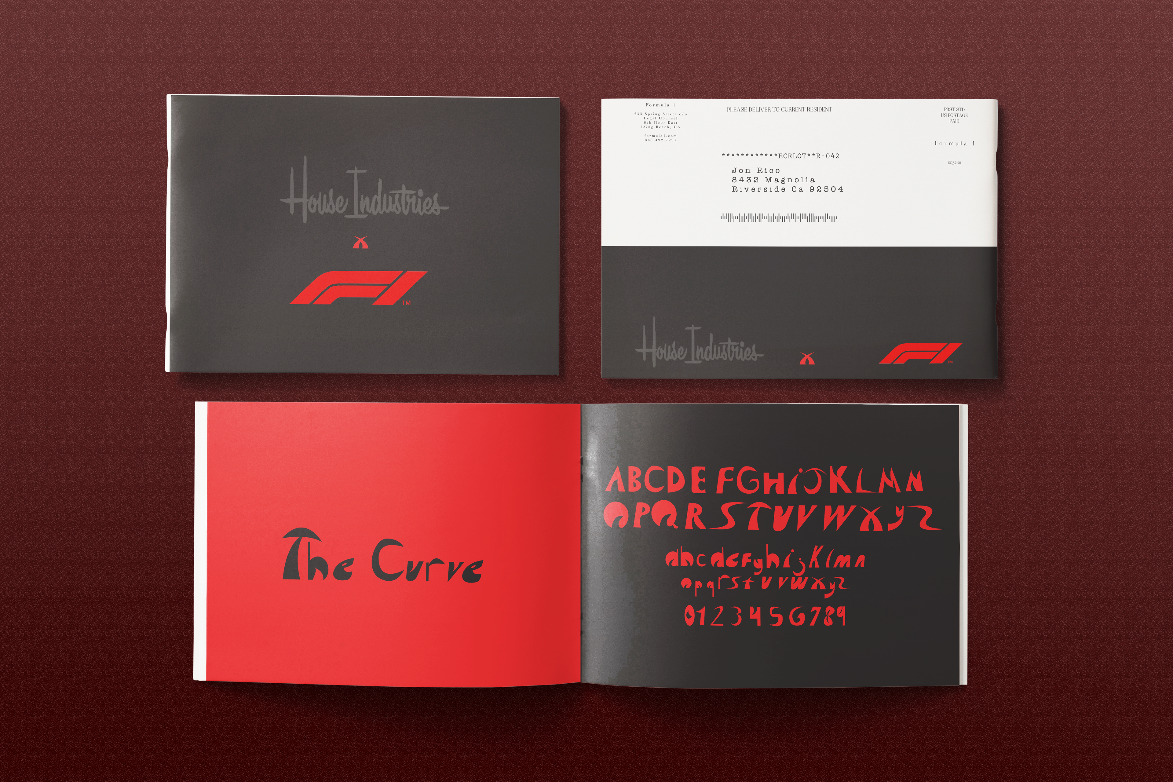
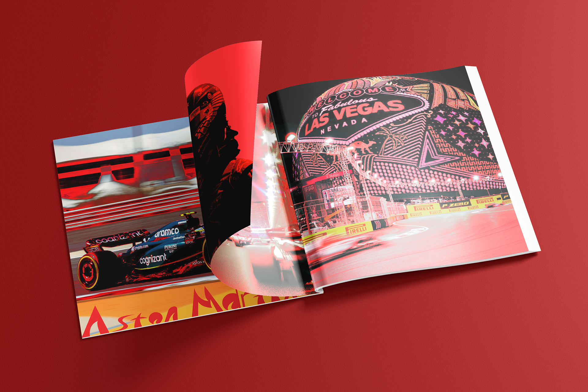
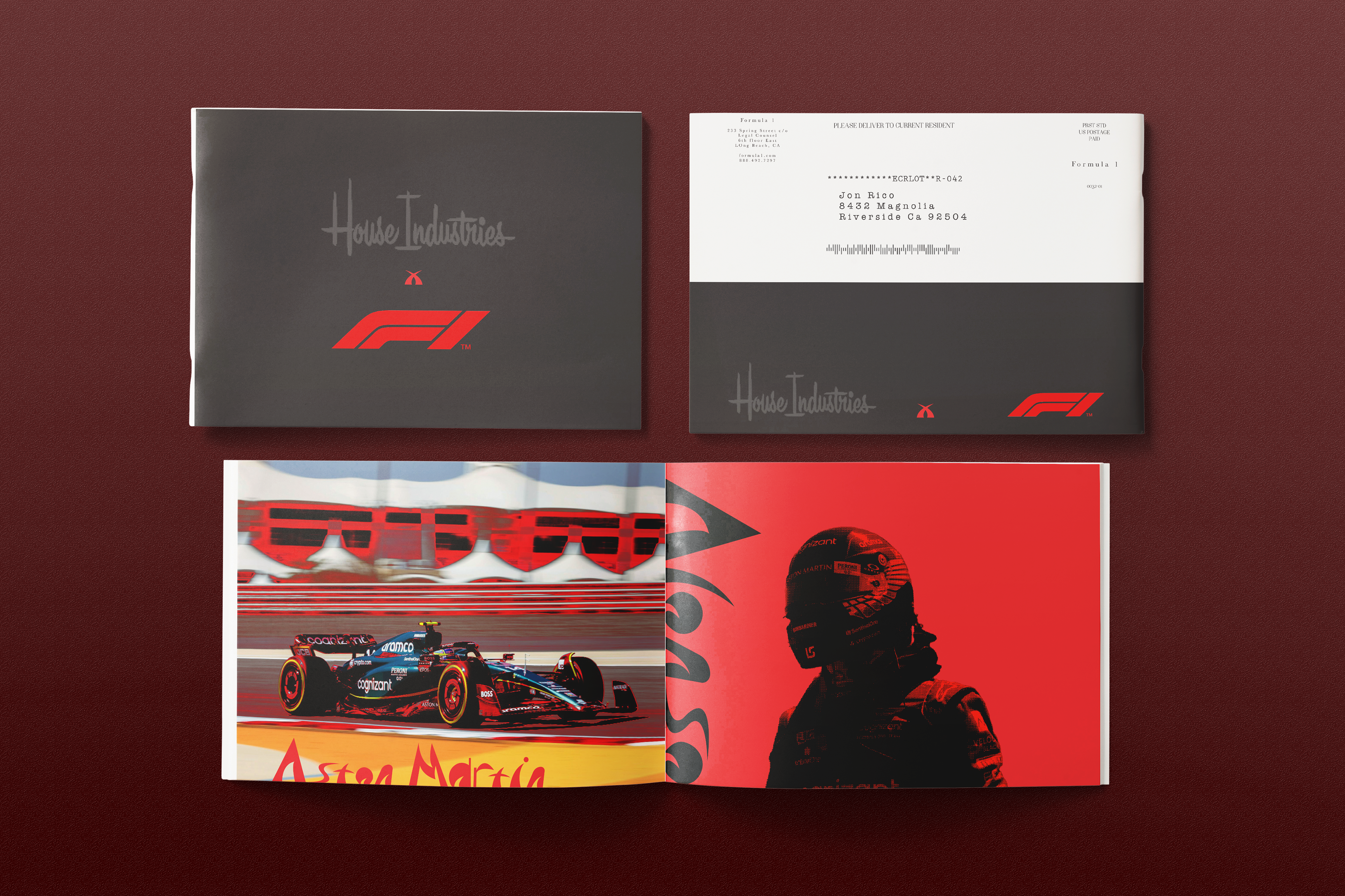
House Industries x Formula 1 Typography Catalog
I was assigned the exciting task of crafting and conceptualizing my own type catalog. Drawing inspiration from the dynamic and sleek aesthetics of the 2023 Las Vegas Grand Prix Race, I chose to title my catalog “The Curve.” This name encapsulates the fluidity and speed associated with both racing and typography design, setting the tone for an innovative and exhilarating collection. Through this project, I aimed to evoke the thrill and energy of the racetrack while showcasing the versatility and elegance of typographic forms.
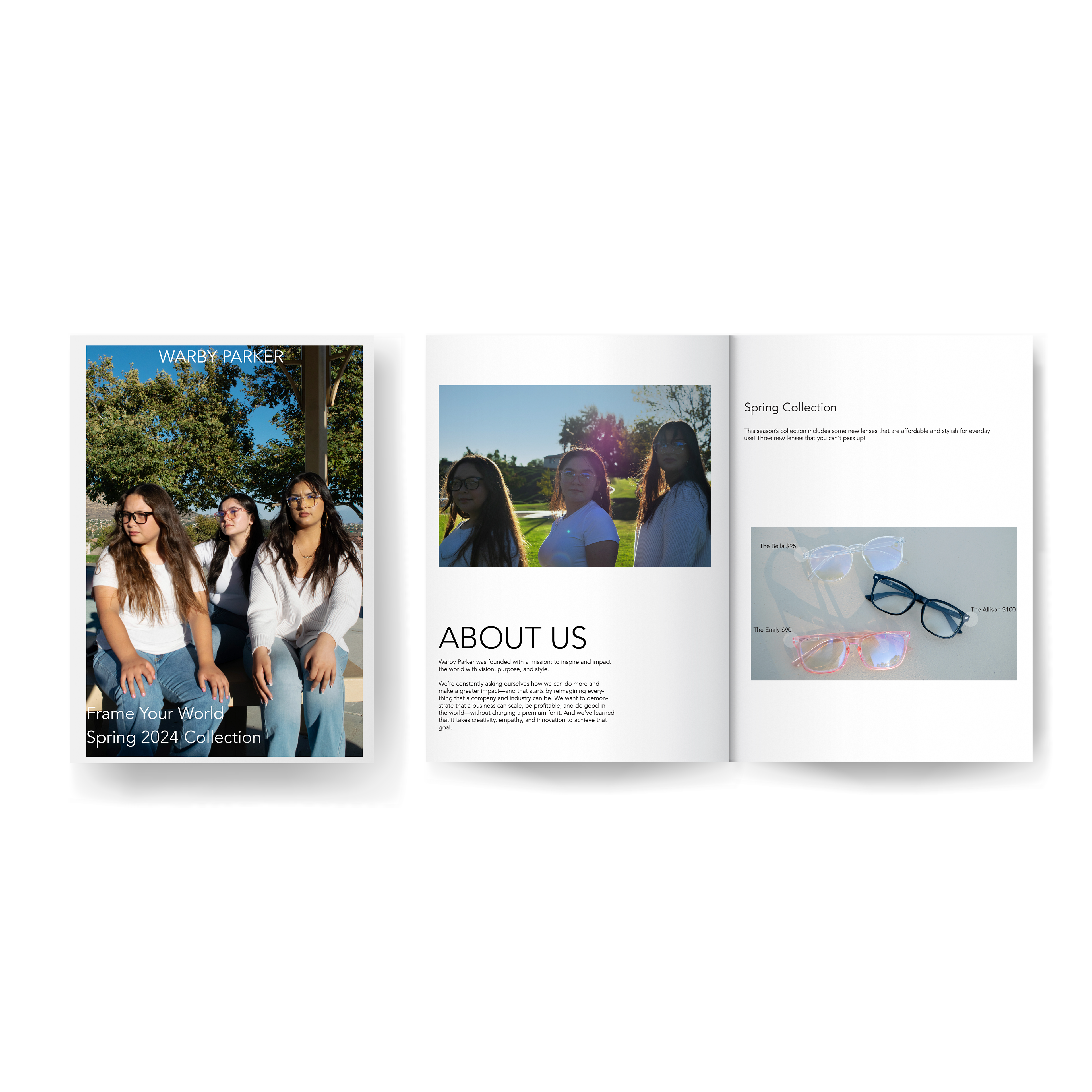
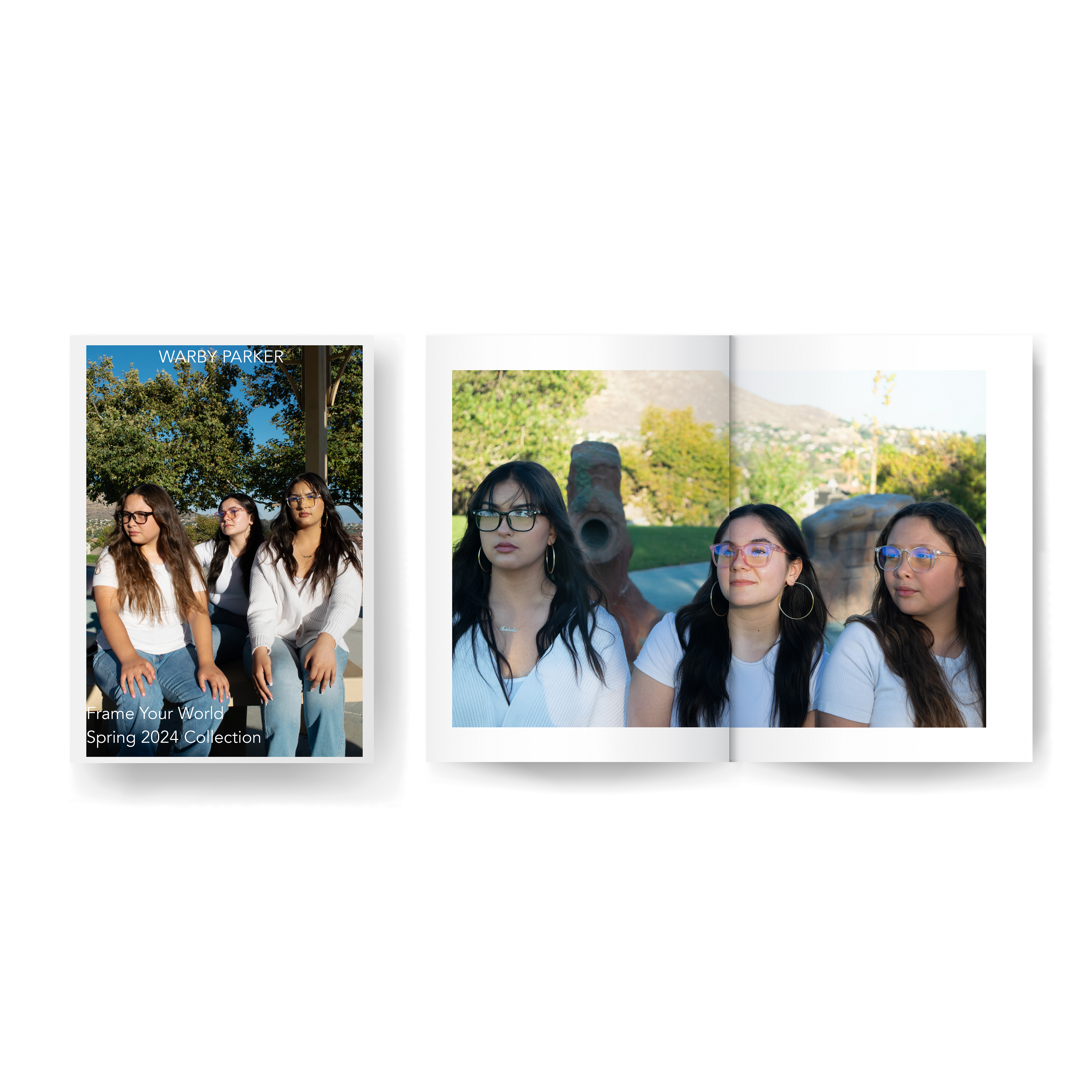
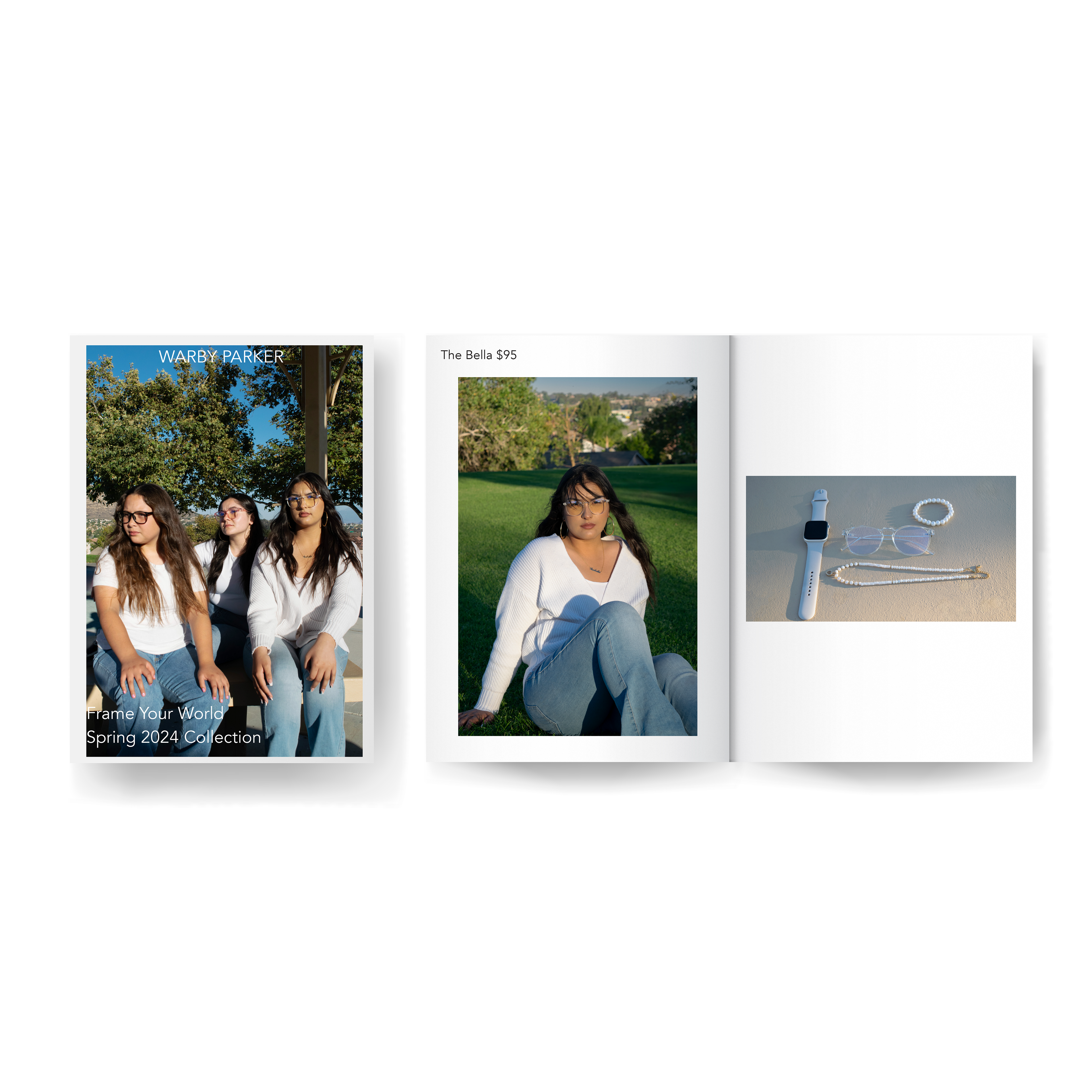
Warby Parker Spring 2024 Catalog
For the Warby Parker Spring 2024 Catalog project, I undertook the responsibility of both photographing and laying out the design. I meticulously selected props and scenery that not only resonated with the company’s branding but also incorporated my own creative flair. Through this process, I aimed to capture the essence of the season while staying true to Warby Parker’s aesthetic identity. The result was a visually compelling catalog that seamlessly blended the brand’s vision with my artistic interpretation.
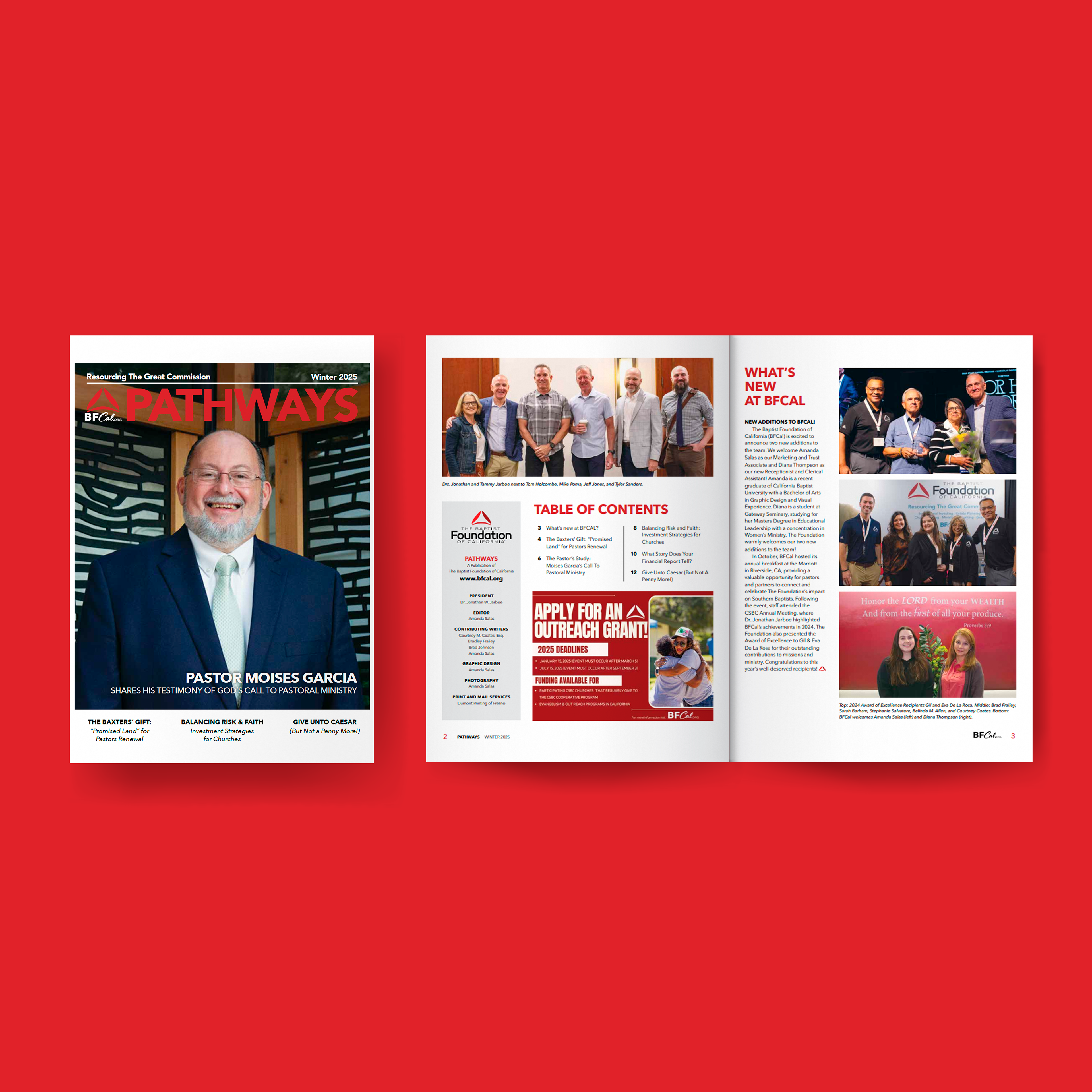
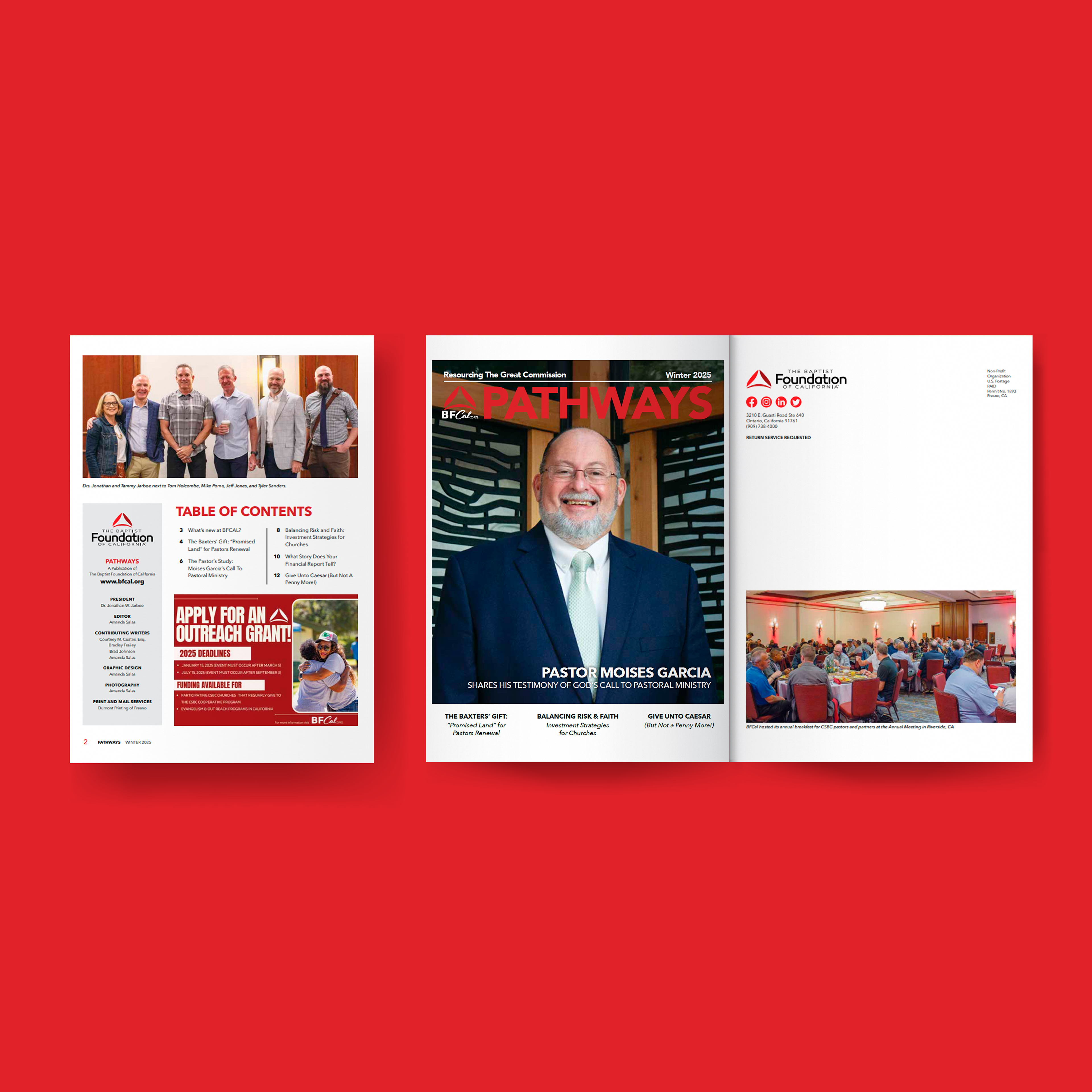
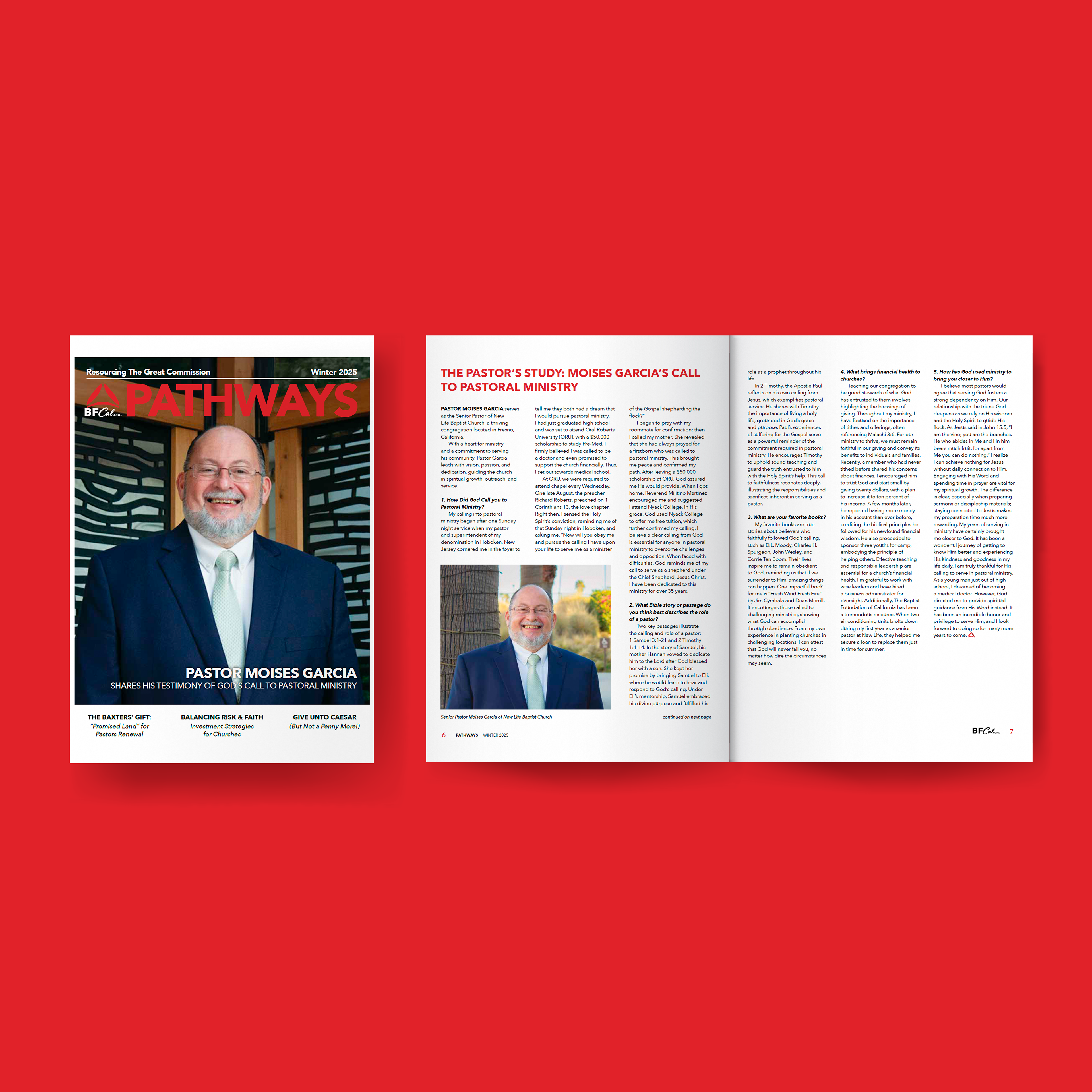
Pathways Winter 2025 Issue
My first design project with The Baptist Foundation of California (BFCal) was an exciting opportunity to collaborate with Dumont Printing on Pathways Magazine. This bi-annual publication is a flagship series for BFCal, showcasing the organization’s achievements and unwavering commitment to Kingdom Causes. Through this project, I played a pivotal role in crafting a design that not only communicated BFCal’s mission but also resonated with its audience. By blending compelling visuals and thoughtful layouts, the magazine became a medium for storytelling, celebrating BFCal’s impact, and inspiring continued support for its meaningful work. This collaboration underscored the importance of creative synergy in producing a publication that reflects both excellence and purpose.